
Each week at the grocery store, we purchase a 2-liter soda bottle. By the time Sunday comes around again, that bottle is usually empty, thus the reason why we buy one on a weekly basis. Because variety is the spice of life, we tend to get a different flavor each time. Sure, we have about six flavors we usually choose, but seldom to we get the same flavor two weeks in a row.
This past Sunday, I made our weekly soda choice based on nostalgia. Before I elaborate, a little bit of background…
If there is one promotional/marketing strategy that was pioneered in professional sports and then seeped through to brands, it is the throwback reintroduction. For years, Major League Baseball teams would hold “turn back the clock” nights where players would wear throwback jerseys from a different era in the organization’s history. Fans always got a kick out of seeing the players wear the old colors and logos of a time long ago. For the older fans it reminded them of the past and for the younger fans it made something come to life that they had only seen in old pictures and grainy video.
In recent years, the retro trend has hit food and drink brands hard. Miller Lite and General Mills cereals are two examples of brands going back to their roots by bringing back logos and packaging from the past. Marketers will say employing this strategy shows that the product has stood the test of time and can be depended on to deliver a consistent, pleasing taste.
As a marketer myself, I understand this. However, as an average consumer, I must admit that retro packaging doesn’t necessarily make the brand more credible in my eyes, it just makes me more interested from a nostalgic/historical standpoint.
When I see something on a shelf that is wrapped in branding from the 1970s, it stands out to me. I like to look at how a company presented itself back in a different decade, it is intriguing to me. Even more powerful, when I see a product wrapped in branding from the early 1990s I can’t help but look it over. You see, I was a little kid in the early 90s and when I see a product I enjoy presented in the same way it looked when I was a 5-year-old kid, it gives me a small dose of happiness.
At the Walmart Market on Sunday, as I glanced the soda selection, I saw the soft drink of my childhood in the form that it used to be during those glory years. Staring at me was a row of 2-liter Pepsi bottles with just the simple Pepsi globe logo with no blue background. As I have mentioned in past posts, my parents didn’t let us drink soda that much growing up. An exception was when we visited my grandparents in Walla Walla. When you opened their refrigerator, it was stocked with Pepsi cans, the ones that were white with the globe logo and the Pepsi script running vertical. At the time, it represented freedom and deliciousness.
Now, in the present, that retro logo reminded me of my grandma, my grandpa, and basically my early childhood. Swayed by the throwback logo and by the fact that my father-in-law’s favorite drink is Pepsi, I threw the bottle in my cart.
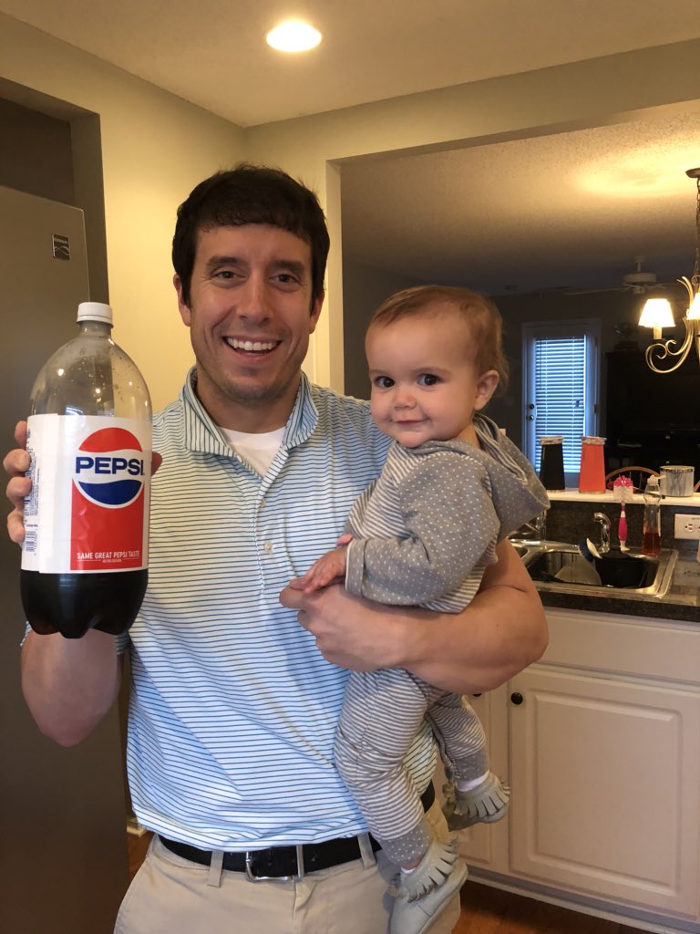
I couldn’t resist; I bought the 2-liter of retro Pepsi.
I am a believer in the power of retro packaging. I think it tugs at people in many different ways and can produce impulse buys on the part of consumers. As long as the retro identity doesn’t stay around long enough to muddy waters with the brand’s current identity, I think it is a great strategy. Don’t Blink.