Although I would argue that social media is closing the gap, a website is the number one marketing tool of an organization. To have a powerful and innovative website is crucial to success. In higher education, this importance is even more pronounced.
These days a good university website engages prospective students the moment they access the URL. In a short amount of time, the story of a college must be told creatively and clearly. Gone are the days when a university homepage served as a bulletin board of information where you could find out about the next public lecture.
It only takes a quick glance at our Coastal Carolina website to realize we are behind the times. In our marketing office, we don’t feel an overabundance of pride directing people, especially prospective students, to it. However, we are in the process of changing this.
Bill Plate arrived at Coastal Carolina University about two and a half years ago to serve as the Vice President of University Communication and Marketing. Almost immediately upon his arrival he lobbied for the opportunity to lead the charge to revamp the CCU web experience. Explaining to the administration that we could either patch up the current site or build a top of the line, sparkling new one, our President elected the latter. By the time I joined Coastal about a year ago, this project was about to get started.
In December we started working with a company called iFactory. Not just a higher education web design firm but rather a wildly successful multi-industry design firm, we knew that investing in them would lead to something special. Bill created a small “core team” that would work hand-in-hand with iFactory throughout the whole project. Knowing the major disadvantages of having too many cooks in the kitchen, it was important to assemble a tight group that could focus on a nine-month project with our new partner while at the same time making important decisions.
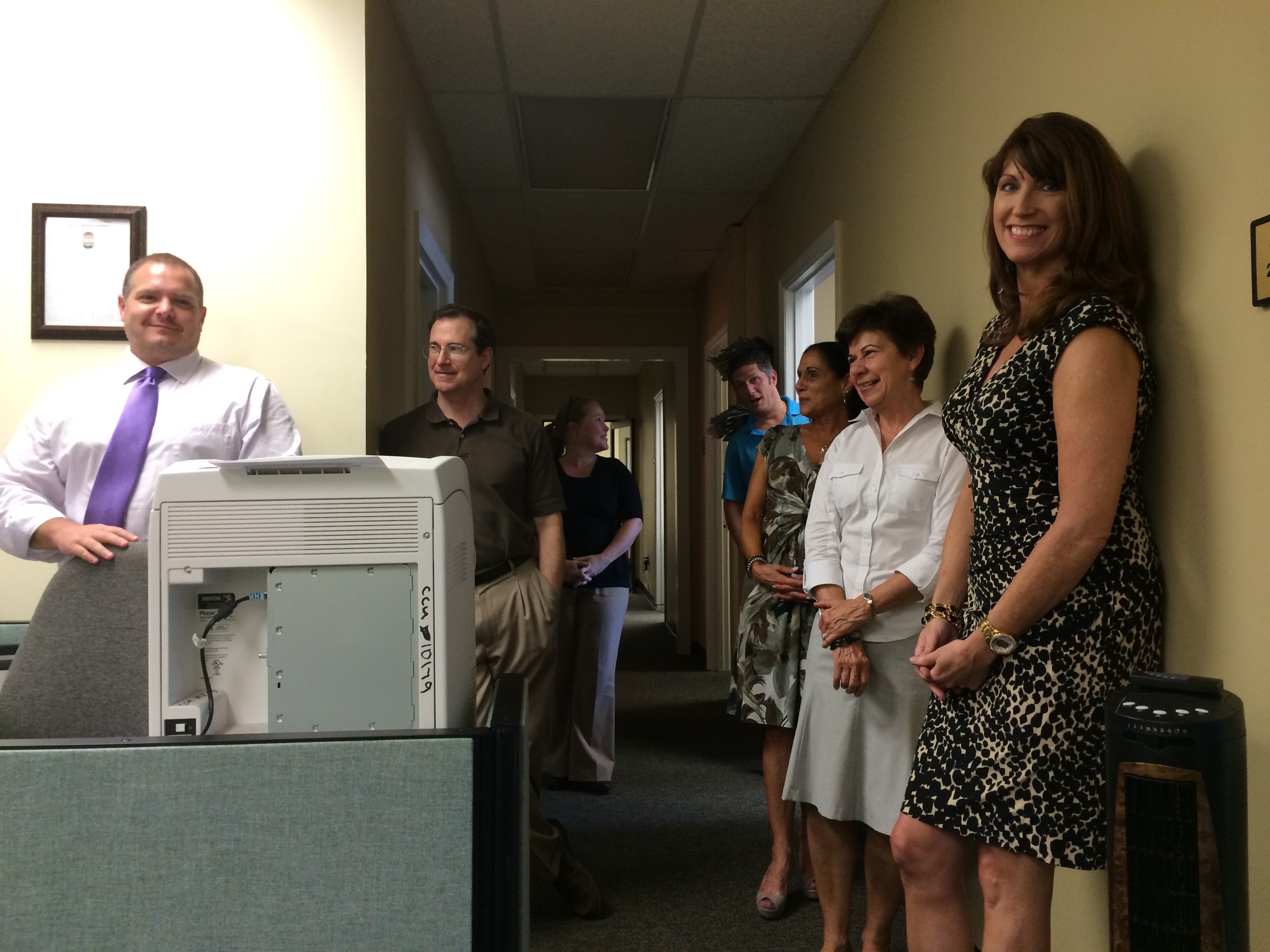
Bill asked me to join him on the team. He also asked another member of our University Communication team, our Director of Creative Services, to serve on it. The three of us merged with four folks from our IT department. In a very smart move, Bill also added two web design professors to sit in with us as well. For the past five months our core team has met at the very least once a week to work on this monumental project.
Of course joining us a thousand miles away via conference call in Boston have been our friends at iFactory. We started small working on discovery stages such as developing a strategy and analyzing our users. But, over the past couple months, the project has started to take shape. We have developed our user personas, built our site map, constructed our wireframes, and started in on the fun stuff…the art design! With things really heating up, two big developments occurred over the past couple of days.
Yesterday the two people in charge of the project from iFactory’s end, Pete and Courtney, flew in from Boston to meet with us. After meeting them in-person at the start of the project in December, it had been a long time and countless conference calls since we got to see them in the flesh. After lunch we delved straight into the user experience portion of the project. Pete offered us out-of-this-world, crazy concepts…exactly what we wanted. You see, our mission of this project is to not develop just another typical .edu site. The options he gave us were unlike anything you would associate with your typical ________ State University. It was exciting.
Today was the big day though. We held a university-wide town hall meeting for the community to attend. During the meeting we would discuss the scope of the project and then (gulp) open it up for questions. You can’t deny it, change is difficult on many. With news that a major overhaul would soon overtake coastal.edu, staff and faculty at CCU wondered what it would mean for them.
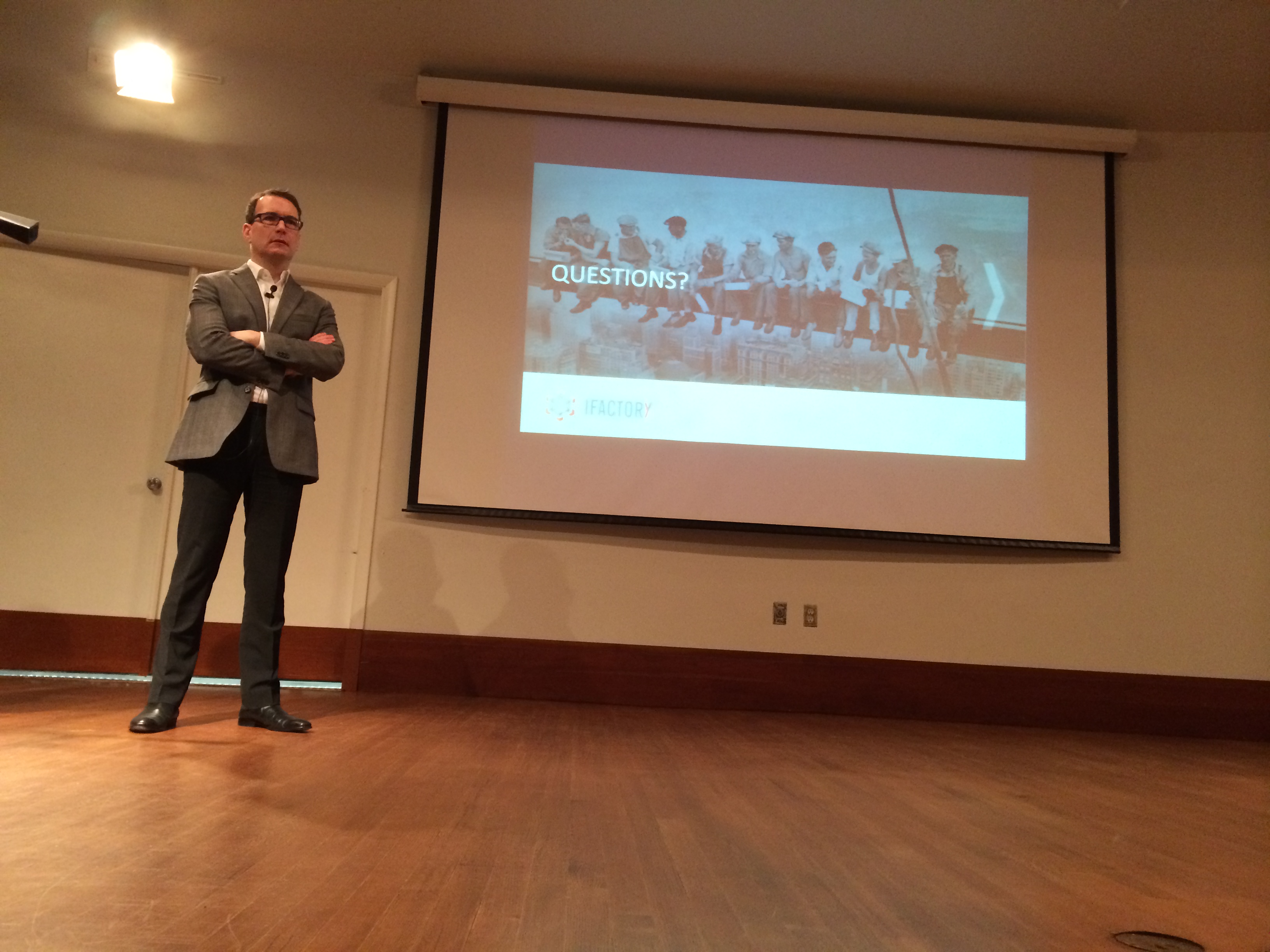
Bill delivered the opening address and then turned it over to Pete. With all eyes on our strategist from Boston, Pete was on his game. He eloquently explained the stages of the project and the desired outcome. He made no qualms about the fact that our website would now be about prospective students. He put it very bluntly that the homepage of coastal.edu is not for current students to access Moodle or for faculty members to pull up university policies. Sprinkling in doses of humor throughout his hour presentation he also reminded the audience that while feedback was appreciated, the big decisions would rest with the core team. He then turned it over for questions.

Bill started the town hall meeting off. The event took place in Johnson Auditorium of the Wall Building on the campus of Coastal Carolina University.
Pete had done an excellent job but would the audience be receptive? It was clearly put that major changes were coming. I expected moderate pushback. But surprising to me, the resistance was actually minimal. The audience asked several good, well-phrased questions. Pete and Bill both did very answering them. The town hall was by all accounts a success.
Of course the real test will come in the fall when we launch. I remember when I was part of the website overhaul while working for Grizzly Athletics. We replaced our static, embarrassing website with a brand new site created by CBS Sports that incorporated video, sophisticated statistical tracking, and an enhanced fan experience. Some people claimed to prefer the old one. Unbelievable. But then again, to draw on the major point of this whole thing, it is not about “some people.” Rather, it is about the prospective student. When our final product is ready for all to see, our target audience visiting coastal.edu will be blown away. This isn’t going to be your grandfather’s university website. Don’t Blink.


Pingback: Rolling Out the Modernized WSU Brand | Don't Blink